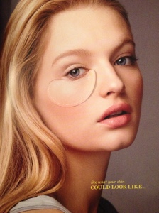
This is an eye opening, interactive, double sided print advertisement, by “The Real Cost” anti-smoking campaign, that can be found in the April 2014 edition of Seventeen magazine.
Seventeen magazine targets younger women. Their main readers are between 12-19 years of age. This magazine has a lot of variety. Rather than being a fashion exclusive magazine they have lots of fashion, but they also focus on, health, beauty, body, and love. This gives them the ability to reach many different types of young women all in one magazine.
The target audience of Seventeen magazine is similar to the target audience for “The Real Cost” ad that is raising awareness about smoking. This ad is definitely reaching out to young women with beautiful skin, and who are in middle school and high school which are one of the most peer pressured parts of their lives.
This ad is effective in the Seventeen magazine environment because the young women who are flipping through this magazine are going to be attracted to the ad for many reasons. First, this double-sided ad is the thickest page in the whole magazine. Second, it looks like a makeup ad on the first side with the lift and peel flap under the model’s eye. Also, the headline says, “See what your skin COULD LOOK LIKE…” This headline is very catching to a young woman who might a few skin problems from ever changing hormone levels. These elements hook the reader into paying attention to the ad, then when they flip the page or peel the flap off the first page they see the real point of the ad which is conveyed through the imagery and both the subhead and the body text. The subhead finishes the sentence that was started on the first page, “…if you SMOKE.” Then under this the body copy reads, “Cigarettes can cause wrinkles that age you prematurely. What are cigarettes costing you?” Both the horrifying truth of the text and visual elements are really effective in the power that they give the ad and the message that the ad is trying to convey.
Overall I really like this ad and think that it differentiated itself enough from the rest of the ads in the magazine to really grab the readers’ attention. I do think that if the page would not have been thicker than the rest of the pages that the readers would have passed right past the ad because it is kind of plain and looks like any other makeup ad but less exciting. I also really liked the idea of having a lift and peel piece of paper under the model’s eye. To be honest this interactive part of the ad is what first caught my attention, because I thought it was for some type of makeup. My reaction to this detail of the ad is exactly what the creators of the ad wanted to happen, because as a reader of a girly magazine you are absolutely shocked to see wrinkled damaged skin under the flap when you were expecting beautiful perfect skin to appear. This shock reaction gets the reader interested, therefore they read the rest of the ad. This ad all together is perfectly creative and effective!

This IS a great print ad! I would definitely be drawn to opening this ad to see what my skin could look like!
This ad is so cool! Excellent analysis of the target market that the advertisers are trying to satisfy. I can definitely attest to the idea that many women (myself included) are fixated with skin, skin problems, and skin problems. Because of that, this ad does seem really effective.
This is a simple ad that does a good job of illustrating the effects of smoking. I also thought it was a makeup ad when I saw it, and that’s what made me look closely at the ad to see what product was being advertised.